|
While you might not notice as you enjoy playing a video game, the elements and principles of design are always present within them, whether that mean the design follows a certain structure, or purposefully denying them. When the creator of a game can fully understand these concepts, they can manipulate them whichever way they please. 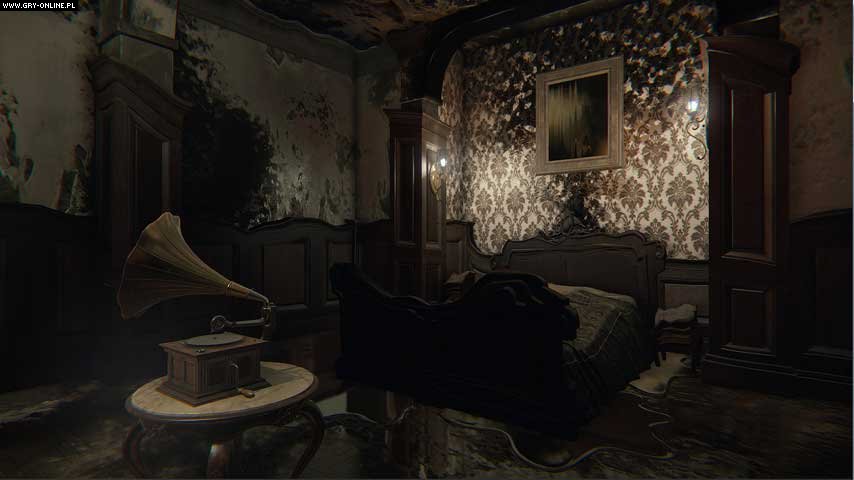 Since we are still in spooky season, and with the second game's trailer reveal being released, I decided to look over this screenshot taken from the game "Layers of Fear". The colors in the room are mostly very dark and dull, and the palette gives the room a sense dread. You can see in this image that the room takes the appearance of melting, and the walls are being covered in a darker shade. The alignment of the background pillars and all the shapes being used here could make the player quite uneasy, especially in the spur of the moment. How everything around it except for the record player is decaying places emphasis on the object.  The next game you will probably remember hearing about, if you hadn't already played it yourself, is "Cuphead". With its challenging and fun gameplay and great game design, there's a reason it was so popular. I'm going to focus on the design of the game, though. In the screenshot taken from the game above, you can already get a feel for what the level is all about. The color palette indicates water, and marine life, and the black outlines around the characters gives them emphasis and separates them from the background while giving them a more cartoon-ish look. Using two primary colors for the main characters makes sure that they are not included in the themes of each level, individualizing them. Using different art styles in the forefront and background was also a good way to keep a simplistic yet involved design.
In Summary:
Sources:
0 Comments
Color, being an element of design, is important whether that be with your choice of palette, placement, or where you want there to be a lack of color or not. If you are having trouble emphasizing certain parts of your images, you might not be using color in your favor, or to its advantage. There are many different ways color can be used to emphasize certain parts of an image. One way you could place emphasis on parts of your image would be to have a greyscale image, and then add color only to the parts you think are of importance, and you want the viewer to pay the most attention to. this is a more extreme method, but if you feel that you like that effect, it's perfect for images where you might have solid colors for one or more focal points. Another method you could use is using complementary colors. Let's say you have a background that isn't of much importance to the overall image and you don't want anyone focusing to much on it, you could place emphasis on the focal point(s) by using a color opposite to that of the background, and add vibrancy. You may want to dull down the background if you still aren't getting the effect you want by trying different tones and shades with it.
It's the spookiest month of the year, and to commemorate this special month, I'm dedicating this blog post to a spooky game that you've probably heard of: "Doki Doki Literature Club". "Doki Doki Literature Club" is a visual-novel and psychological horror game developed by Dan Salvato, and if you have not yet played it I would suggest doing so before reading this because there are probably spoilers ahead. I played the game almost a year ago now, but the underlying messages on cash-grab visual novels have stuck with me. You play the role of a male protagonist; not much there personality-wise, but somehow an all around loved character. The four girls you meet are blatant, and slightly nauseating, anime troupes. Although at first it just seems like a boring and not though out visual novel with bland character dialogue, foreshadowing, and the poem mechanic of the game was a clever way to fit in the game's hidden lore, and there was so much foreshadowing you probably won't be able to catch it all if you don't play many several times through.
The first time you are thrown into a dark and highly disturbing situation, the mood suddenly changes completely. Once the nature of the game is revealed, looking back on the beginning of the game, instead of seeing a fairly harmless, but distasteful dating sim, you see something much more eerie. As you continue you are faced with a slowly distorting environment, with characters becoming more and more disturbing. Scenes that happened in the first run through are changed only slightly, but these changes are what affect the game significantly. You are faced again with a disturbing fate, but this time something changes. This time you restart the game will change completely. Setting aside the story line and lore, I want to talk about the point Dan Salvato is trying to bring up. the ridiculous nature of poorly made dating sim visual novels that have been growing. He uses dialogue, character design, and even the game files to sort of parody what you would normally see in those types of games. The game itself makes a mockery of those who played the game with the thought that it would be one of those types of games. Towards the end of the game, you are even told that if you had payed more attention to the game's tags you wouldn't have been so shocked at the outcome of the game. There is much more to say about this game, with the storyline, the hidden lore, and how the creator utilizes the game's files as a game mechanic and to hide a few easter eggs, but I've already made a pretty long post. Who knows, maybe I'll discuss those aspects more in another post? If you've ever seen or played the Portal games, you've probably recognized the immersive environment it takes place in. A big part of the Portal games is the color palettes used. As you can see from the screenshots taken of the games below, the color scheme is very cool-toned and simple, with a grey-blue toned background. The background is a very light shade of a grey-blue hue which gives the environment a futuristic, and minimalist feel. The accents of color used also go with the cool color scheme, with cool-toned reds and blues. Very light oranges and yellows hues are also used, but aren't used as often so not to take away from the overall environment.  Different colors will convey different feelings, and this is used in the Portal games. As mentioned above the environment of the games seems very futuristic with metallic greys, blues, and many cool colors. The portals themselves use different hues to show different meanings. In the screenshot below color is used in a way to show items of importance. The vibrant blue and cool red stand out from the dull grey background, showing the player what to pay attention to. The red is used to indicate a button, and the light blue acts as a guide. The color palette used in the Portal games is very simplistic, with varying cool-tones with dull, grey hues for the background and pops of color for items of importance. This gives the game an overall futuristic, slightly eerie feel to it, and the choice of color palette helps immerse a player into the game itself. 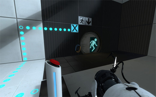 In Summary:
The world is changing everyday, and so is the technology. We have been able to create software that can bend our views of reality with the click of a few buttons. So, how do we use it? Well, naturally the human race will want to "enhance" or
change their appearance; we do it all the time. But when we pretend that these changes are not changes at all is when it becomes dangerous. Almost every picture you see is most likely altered in some way by Photoshop, most of the time you wouldn't even be able to notice. This is what changes our perception of beauty: how it is shown by mass media. You go onto social media, and almost every picture of a person will have been edited by Photoshop, or other photo editing software, but since it looks natural you might just think the photo is untouched. This could make you see flawless people and begin to think this is how most people look, or how they "should" look. When this sort of thing happens you won't even notice your perception of beauty change, but gradually you get more hard on yourself. When you look in the mirror you might be looking for that model you saw online the other day, but that isn't real. You were given this image that was claiming to be real, though, and once you believe it, your perception of beauty has changed to one that is unachievable at the moment. But what is a method to look as close to the models in the touched up photos? The answer is plastic surgery. I think plastic surgery would normally be fine as long as what you are doing is safe. Like I said above it is natural that humans are interested in altering their appearance. But the problem comes when you want a quick, affordable, easy way of changing your face or body. Illegal underground methods are being used more and more often it seems, and we see time and time again the affects it can have on a person. Even when going to someone you think you can trust with plastic surgery it's still risky. Photoshop can influence people to a point where they will take risks to change their appearance to reach an unnatural beauty standard. If you are thinking about getting plastic surgery, make sure it is on your own accord and not influenced by the pictures you see online, because if it isn't something you truly want for yourself it isn't worth the risk. And if you do get plastic surgery or alter your appearance online using photo editing software, please be open and honest about it for the people who might be negatively impacted by the dishonesty. In Summary:
|
About meI am a Senior at DSA and currently taking the Advanced Game Art and Design course. I enjoy playing video games and drawing in my free time. The opinions expressed within this blog are my own, and do not reflect that of Durham School of the Arts of Durham Public Schools Archives
May 2022
Categories
All
|
 RSS Feed
