|
Moving ahead we are going to be working on level design and creation, and the steps, process, and details that make a level fun and playable. One of the most important aspects of level design goes back to flow, a concept discussed earlier in the year. Your design should always keep in mind difficulty vs. fun, so as to be difficult enough to make for an interesting challenge, but not enough to the point where the game is no longer enjoyable, or even unplayable. Issues with difficulty vs. fun can be mediated by things such as spawn points; another good example would be the Osu! mods I went over in my last game review. Setting up diagrams is a key part of the process when designing levels. This is how you can set up your puzzles/challenges/obstacles and solely focus on those aspects to be used later in the process when actually creating the level. This will allow you to set up your obstacles, challenges, opponents, etc. without having to include aesthetics or art, so it's purely a reference for the level setup. The art behind level design is still important too, though. Making sure you have a consistent theme in your art and environment will help make the game more immersive and enjoyable for the player, jarring changes in aesthetic or art style can take the player out of the immersion.
In Summary:
0 Comments
While you might not notice as you enjoy playing a video game, the elements and principles of design are always present within them, whether that mean the design follows a certain structure, or purposefully denying them. When the creator of a game can fully understand these concepts, they can manipulate them whichever way they please. 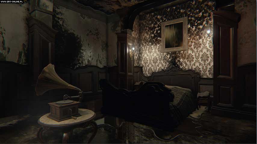 Since we are still in spooky season, and with the second game's trailer reveal being released, I decided to look over this screenshot taken from the game "Layers of Fear". The colors in the room are mostly very dark and dull, and the palette gives the room a sense dread. You can see in this image that the room takes the appearance of melting, and the walls are being covered in a darker shade. The alignment of the background pillars and all the shapes being used here could make the player quite uneasy, especially in the spur of the moment. How everything around it except for the record player is decaying places emphasis on the object.  The next game you will probably remember hearing about, if you hadn't already played it yourself, is "Cuphead". With its challenging and fun gameplay and great game design, there's a reason it was so popular. I'm going to focus on the design of the game, though. In the screenshot taken from the game above, you can already get a feel for what the level is all about. The color palette indicates water, and marine life, and the black outlines around the characters gives them emphasis and separates them from the background while giving them a more cartoon-ish look. Using two primary colors for the main characters makes sure that they are not included in the themes of each level, individualizing them. Using different art styles in the forefront and background was also a good way to keep a simplistic yet involved design.
In Summary:
Sources:
If you've ever seen or played the Portal games, you've probably recognized the immersive environment it takes place in. A big part of the Portal games is the color palettes used. As you can see from the screenshots taken of the games below, the color scheme is very cool-toned and simple, with a grey-blue toned background. The background is a very light shade of a grey-blue hue which gives the environment a futuristic, and minimalist feel. The accents of color used also go with the cool color scheme, with cool-toned reds and blues. Very light oranges and yellows hues are also used, but aren't used as often so not to take away from the overall environment.  Different colors will convey different feelings, and this is used in the Portal games. As mentioned above the environment of the games seems very futuristic with metallic greys, blues, and many cool colors. The portals themselves use different hues to show different meanings. In the screenshot below color is used in a way to show items of importance. The vibrant blue and cool red stand out from the dull grey background, showing the player what to pay attention to. The red is used to indicate a button, and the light blue acts as a guide. The color palette used in the Portal games is very simplistic, with varying cool-tones with dull, grey hues for the background and pops of color for items of importance. This gives the game an overall futuristic, slightly eerie feel to it, and the choice of color palette helps immerse a player into the game itself. 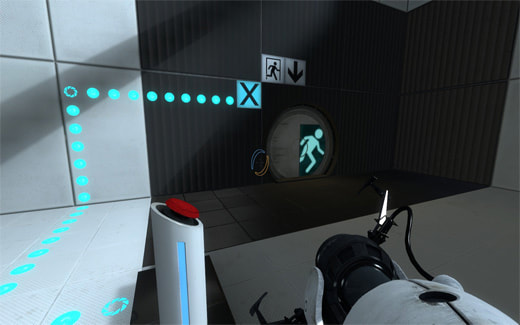 In Summary:
|
About meI am a Senior at DSA and currently taking the Advanced Game Art and Design course. I enjoy playing video games and drawing in my free time. The opinions expressed within this blog are my own, and do not reflect that of Durham School of the Arts of Durham Public Schools Archives
May 2022
Categories
All
|
 RSS Feed
